
MARSCOMICS
More than a cast of heroes. A universe you can enter.
Connecting original characters, distinct visual worlds and long-form storytelling through one recognizable publishing identity and an immersive bilingual digital experience.
01 / THE CREATIVE AMBITION
Give an original universe a place to live.
A memorable character can start a story. A coherent universe gives that story somewhere to grow.
MARS Comics is an original creative universe developed by Sébastien Marchi. Its ambition extends beyond presenting individual illustrations: characters, settings, conflicts and visual identities need to feel as if they belong to a larger publishing world. The website becomes the place where those relationships can be discovered, understood and revisited.
For Cyber Resistance Studio, the challenge is to translate that imaginative scope into an experience people can actually enter. An audience should be able to move from a striking first image to a particular hero, understand the tone of that series, and find a clear route into the story. Atmosphere earns attention; structure gives it a destination.
The project brings together several kinds of design that are often treated separately: a publisher identity, character-level art direction, editorial hierarchy, content organization and the practical behavior of a website. The objective is to make those layers support one another. Every visual decision should help the audience recognize the world, while every interaction should make that world easier to explore.
02 / PUBLISHER & SERIES IDENTITY
One name above the door. Distinct identities inside.
The MARS Comics identity creates continuity without making every series look the same.
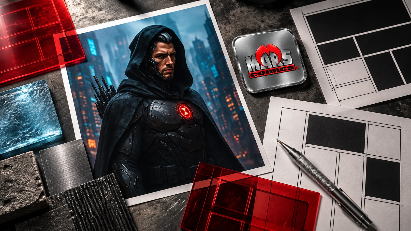
The supplied MARS Comics badge establishes a material, assertive identity: brushed metal, beveled silver lettering and a strong red emblem. It feels like a mark attached to an object rather than a label floating over content. That physical quality provides a useful foundation for a universe expressed through covers, title treatments and richly textured environments.
Below the master identity, each hero or series needs its own voice. Character names and logos act as meaningful entry points, not simply headings applied to a repeated template. An icy world, an underground industrial setting and a fractured technological future should not all greet the reader with the same visual language.
The design system therefore works at two levels. The publisher provides consistent navigation, editorial cues and a recognizable sense of authorship. The series supplies its own atmosphere, materials, image language and typographic emphasis. This is a brand architecture problem as much as a graphic one: the relationship between the whole and the individual world must remain legible as the universe expands.
03 / WORLDBUILDING THROUGH DESIGN
Let the environment carry the character of the story.
Texture, light and material become part of the narrative before a reader reaches the first paragraph.
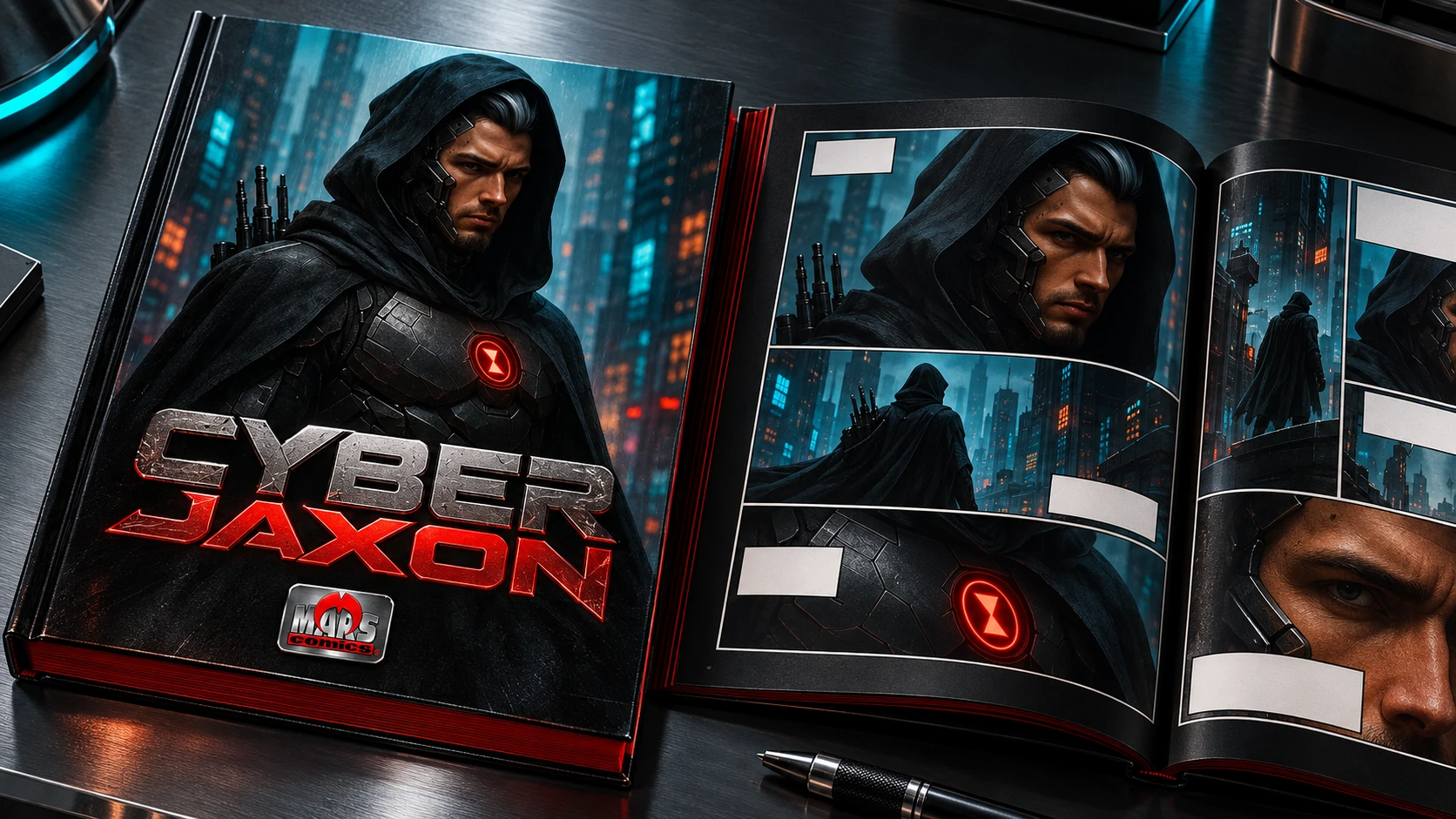
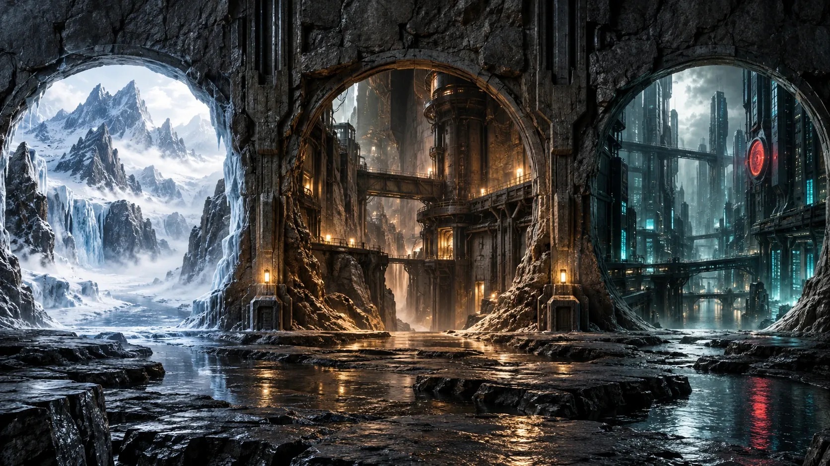
The art-direction framework treats each world as a specific place. Frost calls for mountain cold, ice and natural formations. Grind moves toward aged metal, underground infrastructure and darker gunmetal. Cyber Jaxon belongs to a charcoal technological world with turquoise light and controlled red accents. These are distinct narrative climates, not alternate color filters on one background.
Neave and Syndicate Z introduce another material language: brutalist concrete, a darker porous surface and a restrained purple haze. The difference matters because it gives the audience a visual memory of where they have been. A series should remain recognizable through its atmosphere even before its title becomes visible.
Those worlds also have to work as interfaces. Textures must support readable copy; image transitions should feel cinematic without obscuring navigation; the background should move naturally with the page rather than competing with the reading experience. The goal is immersion with control: enough atmosphere to invite exploration, enough visual discipline to let the story remain central.
One universe. Many worlds. A reason to explore.
05 / EDITORIAL EXPERIENCE
Make reading feel like entering the world—not leaving the interface.
Cinematic imagery and long-form content need a shared rhythm.
A comics website can promise visual impact and still ask its audience to read. The two ambitions are complementary when the page has a clear editorial rhythm: a large image establishes the setting, typography introduces a story beat, and generous spacing gives the next passage room to breathe. Images should advance the experience rather than repeat the same scene at every turn.
The Cyber Jaxon work on Cyber Resistance Studio provides a concrete editorial reference within the broader MARS Comics universe. It organizes a serial narrative through seasons, episodes, reading order and progressive visual exploration. That structure demonstrates how the story can remain primary while navigation quietly carries the reader forward.
The bilingual dimension adds another requirement. French and English versions need equivalent destinations, coherent titles and language links that keep the reader inside the same story. A language switch should not send someone back to an unrelated landing page. The experience is designed around continuity: of character, of narrative order and of the reader’s place in the universe.
06 / FROM ART DIRECTION TO DEVELOPMENT
Build a framework that can hold many different worlds.
Consistency belongs in the underlying system. Expression belongs in each series.
The development approach separates reusable structure from series-specific presentation. Shared page patterns can support a character introduction, a dossier, a story archive and a reading page. Content and visual direction then determine how those structures feel. This allows the project to grow without requiring every new series to begin with an unrelated interface.
Naming, content hierarchy and asset organization become important production tools. A character portrait, a campaign image, a series logo and a story panel have different jobs. Keeping those roles explicit helps preserve the right crop, the right context and the right relationship between image and text as material moves between the home page, a mini-site and an editorial feature.
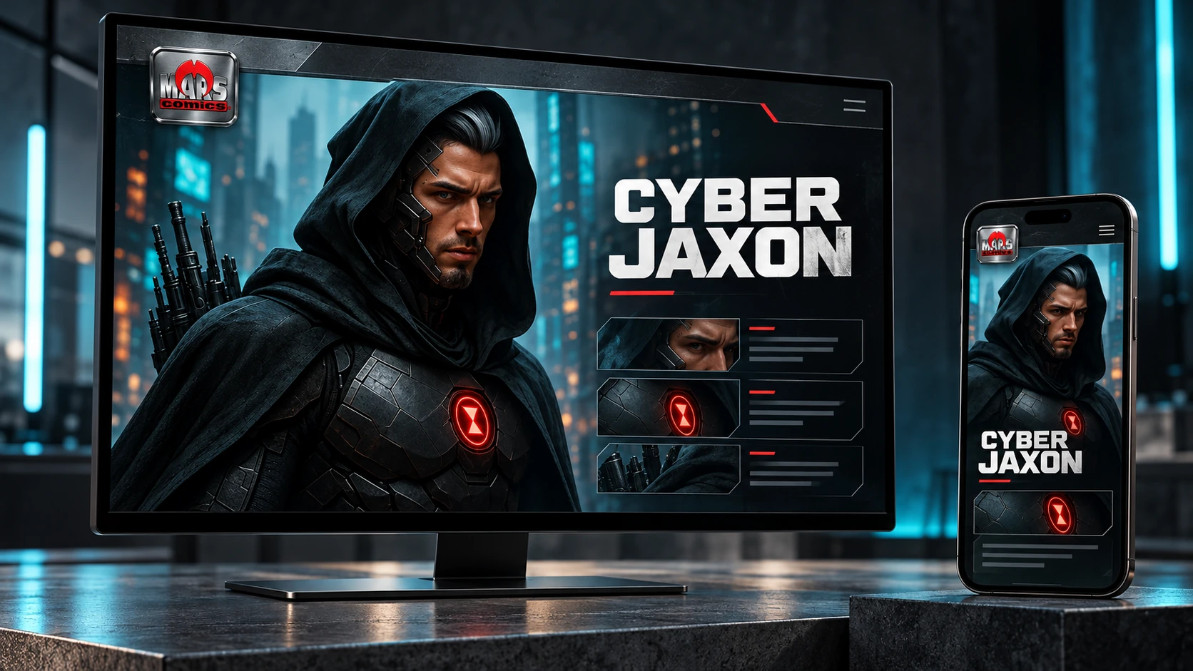
The same care applies to interaction. Navigation needs to remain available without covering important artwork; mobile controls should be reachable; images should retain their proportions; and a media view should have a clear route back into the page. These practical requirements let cinematic art direction survive real screens instead of working only in a static presentation.
STRATEGY → DESIGN → DEVELOPMENT → VERIFICATION
From original imagination to an experience people can navigate.
Define the world
Establish the character, narrative context and visual atmosphere.
Shape the identity
Connect the publisher mark with the distinctive voice of each series.
Design the journey
Organize discovery, character dossiers and reading paths around audience intent.
Build & refine
Translate the vision into adaptable pages, bilingual content and usable interactions.
07 / COMMUNITY & PUBLISHING DIRECTION
Design for participation without losing the story.
A universe can become a meeting place as well as a reading destination.
The wider product direction explores personal Comic Shop spaces, social discovery and opportunities for readers to share the stories and issues that interest them. A member page can become a recognizable place within the universe, with a cover, an introduction and selected content. The publishing identity still needs to make clear what belongs to the official story and what belongs to the surrounding community.
That distinction shapes the commerce thinking too. Issue access, membership and referral journeys should be understandable at the point of choice. Someone should know what they are opening, what a purchase includes and what happens next. The portfolio work documents that experience direction without presenting proposed commercial rules as a fully verified production payment system.
The broader ambition can include games, screen adaptations, collectibles and other extensions of the original universe. On the website, these belong to a clearly identified future-facing area rather than being presented as completed releases. An expanding creative vision benefits from precise editorial labeling: available stories, work in development and future possibilities each need their own place.
08 / A COHERENT CREATIVE FOUNDATION
A universe grows through the details it can keep.
The long-term value is not the number of characters on a page. It is the coherence of the world around them.
MARS Comics brings together original intellectual property, a publisher-level identity and a series-led digital design language. The work establishes a way to connect bold imagery with a navigable structure, so that each new character can add depth to the universe rather than simply adding another thumbnail to an archive.
The next development priorities follow that foundation: keep character information consistent, refine the reading paths, maintain visual differences between series and verify member-facing behavior in its real environment. Publishing and community features should be assessed through complete journeys, from discovery to access and return, rather than through isolated screens.
For Cyber Resistance Studio, the project demonstrates a particular kind of creative development: moving from an imaginative world to the design system that allows other people to encounter it. Identity, art direction, content and interface are treated as parts of one experience. The purpose is to make the universe feel expansive—and the next step into it feel clear.
An original world deserves an original digital experience.
Identity, art direction and website development that give ambitious creative projects a coherent place to grow.
Original MARS Comics universe and creative direction: Sébastien Marchi. Identity, digital art direction and experience design: Cyber Resistance Studio, with OpenAI AI-agent support. The five portfolio visuals are custom AI-generated presentations using the supplied MARS Comics and Cyber Jaxon references. Printed editions and device scenes shown here are presentation concepts, not photographs of manufactured products or screenshots of a deployed interface.
← Explore all work
04 / INFORMATION ARCHITECTURE
Turn a large universe into a clear first choice.
Readers arrive with different intentions. The structure must help each of them find an appropriate beginning.
Someone encountering MARS Comics for the first time may want a broad introduction. Another visitor may be looking for a specific character, a comic issue, a team or the next installment in a story. Treating those intentions as one undifferentiated gallery would make the universe feel larger but less understandable.
The planned experience separates the principal modes of exploration: characters and their dossiers, comic books and series, teams, editorial news and the wider MARS Comics world. Individual character pages can then go deeper into origins, abilities, supporting figures and antagonists without placing all of that detail on the home page.
At the series level, a tactical mini-site gives the story room to express itself. A reader should be able to recognize the hero, understand the setting, see what is available to explore and continue through a deliberate sequence. Teams such as the Superiders and Syndicate Z create additional relationships to navigate, while the master structure keeps those relationships from becoming a maze.